yToggleButton
Description
The yToggleButton is a versatile user interface component designed to allow users to toggle between multiple options dynamically. This component is especially useful in scenarios, where users need to switch between more than two states, such as changing themes, toggling settings, or any multi-state control.
Basic Structure
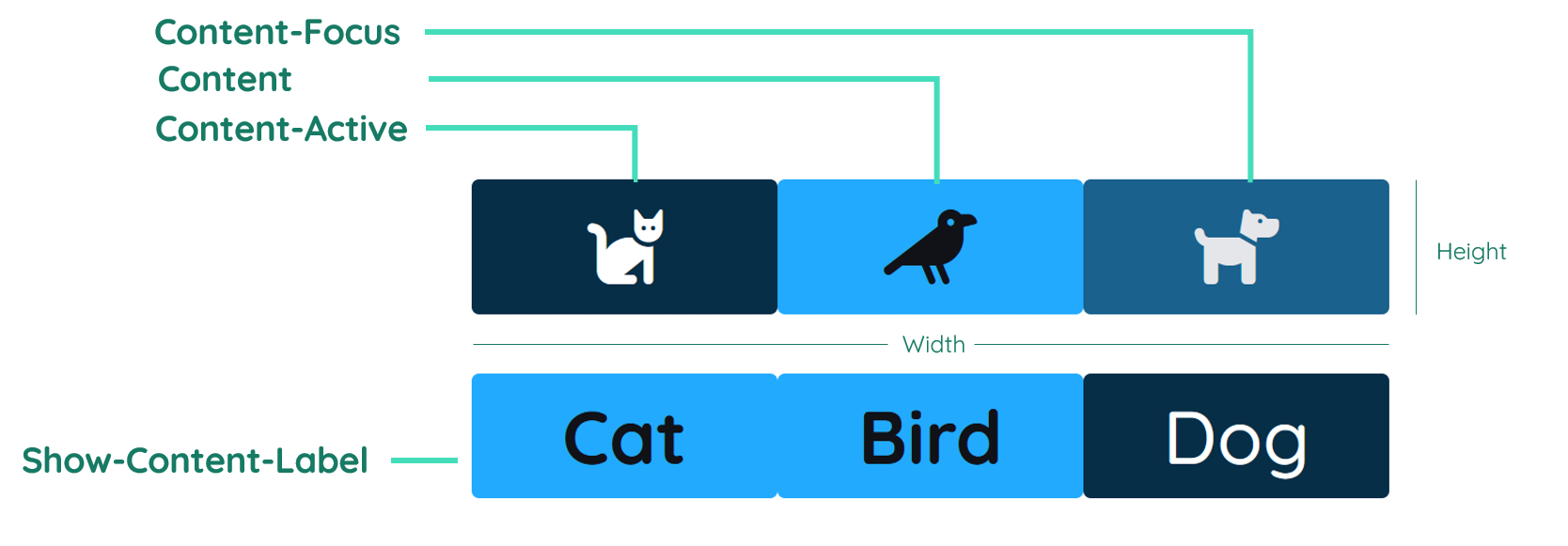
The yToggleButton includes a main body that acts as the clickable area, with visually distinct states indicated by changes in background color, icon color, and typography. Each state can be customized with its own properties to clearly differentiate between the choices available to the user. Each Toggle Option stands as their own unit and will bring a label and or icon with it.
Label
The label contains the text inside the button. It is normally in the center of the unit, but can also be displayed on the right or left site. By changing the inner padding of the button, the label gets moved too. You can find further explanation at the Label Property.
Icon
The icon can be used to show an icon inside a unit of the yToggleButton. You can only choose one icon per unit. You have to choose if you want to show labels or icons for the whole component. You can find further explanation at the Icon Property.
Properties
Through its various properties the yToggleButton can be configured to suit your needs. The display below provides you with an overview of all the yToggleButton properties.
Properties can be changed directly through three methods:
- Inside the Toolbar, which is positioned in your workarea next to your component right where you need it. It shows the most important properties, thus providing a fast and efficient way to configure your component in the most basic way.
- It may also occur in the Toolbar Extension, which is a seamless extension accesible as a dropdown item of the Toolbar. It extends the functionality of the Toolbar by providing advanced pickers for the most used properties.
- Inside the Detail Panel, which is located in the righthand drawer. Every property of a component can be configured here.
- Generic
- Style
- ToggleButton
- Events
METAread more
The identifier of the component that is unique within a page.
The type of the component. For this component it is -toggle-button.
The custom name of the component. It serves for better identification of the component.
The custom version of the ToggleButton-component. This can be used to ensure that all components work well together.
The CoreTheme, which will be apllied to the ToggleButton. For further information on themes visit the themes page.
The subtheme subordinated to the previously specified CoreTheme, which will be apllied to the ToggleButton. For further information on themes visit the themes page.
The group theme is a further variation of the subtheme which is specified especially for variations of a component inside the subtheme. For further information on themes visit the Theme-Manager page.
DISPLAYread more
This property specifies the display behavior of the component. This can be be set to:
- none
- block
- flex
- inline
This property specifies the type of positioning method used for the component. This can be be set to:
- static
- relative
- absolute
- sticky
- fixed
This property can toggle the visibility of the component. The two modes are completely hidden and fully shown.
SIZEread more
The minimum value for the width of the component. This can be set in:
- px
- pt
- em
- vw
- vh
- %
The minimum value for the height of the component. This can be set in:
- px
- pt
- em
- vw
- vh
- %
The value for the width of the component. This can be set in:
- px
- pt
- em
- vw
- vh
- %
- auto
The value for the height of the component. This can be set in:
- px
- pt
- em
- vw
- vh
- %
- auto
The maximum value for the width of the component. This can be set in:
- px
- pt
- em
- vw
- vh
- %
- none
The maximum value for the height of the component. This can be set in:
- px
- pt
- em
- vw
- vh
- %
- none
The flex property sets the length on flexible items. This sets the value in n-fold shares extrapolated to all other components with the flex display within the same container.
PLACEMENTread more
This property creates a space around the component, outside of the top border. This can be set in percent or pixels.
This property creates a space around the component, outside of the right border. This can be set in percent or pixels.
This property creates a space around the component, outside of the bottom border. This can be set in percent or pixels.
This property creates a space around the component, outside of the left border. This can be set in percent or pixels.
This property creates a space within the component, inside of the top border. This can be set in percent or pixels.
This property creates a space within the component, inside of the right border. This can be set in percent or pixels.
This property creates a space within the component, inside of the bottom border. This can be set in percent or pixels.
This property creates a space within the component, inside of the top border. This can be set in percent or pixels.
BACKGROUNDread more
The color of the background. This can be set as a color from a palette or a custom hex color.
BORDERread more
The color of the top border. This can be set as a color from a palette or a custom hex color.
The style of the top border. This can be be set to:
- solid
- dotted
- dashed
- none
The width of the top border. This can be set in percent or pixels.
The color of the right border. This can be set as a color from a palette or a custom hex color.
The style of the right border. This can be be set to:
- solid
- dotted
- dashed
- none
The width of the right border. This can be set in percent or pixels.
The color of the bottom border. This can be set as a color from a palette or a custom hex color.
The style of the bottom border. This can be be set to:
- solid
- dotted
- dashed
- none
The width of the bottom border. This can be set in percent or pixels.
The color of the left border. This can be set as a color from a palette or a custom hex color.
The style of the left border. This can be be set to:
- solid
- dotted
- dashed
- none
The width of the left border. This can be set in percent or pixels.
The radius of the corners of all the borders. This can be set in percent or pixels.
SHADOWread more
The shadow of the component. This is set by the 4 sub-properties x, y, blur and spread of the shadow-property, which can be further read about in the shadow-property section.
OPACITYread more
The opacity of all colored parts of the component. This value is set in percent.
CONTENTNORMALread more
The background-color of ToggleButton for the asdf state. This can be set as a color from a palette or a custom hex color.
The color of the icon inside the ToggleButton for the asdf state. This can be set as a color from a palette or a custom hex color.
The color of the font inside the ToggleButton for the asdf state. This can be set as a color from a palette or a custom hex color.
The font-family of the ToggleButton's text for the asdf state. This can be picked from a large list of provided fonts.
The font-weight of the ToggleButton's text for the asdf state. This can be set in a custom number, as example:
- 400 = normal(regular)
- 500 = medium
- 600 = semi bold
- 700 = bold
The font-style of the ToggleButton's text for the asdf state. This can be set to normal, italic or oblique.
The text-transformation of the ToggleButton's text for the asdf state. This can be set to:
- capitalize
- uppercase
- lowercase
- none
- full-width
The text-decoration of the ToggleButton's text for the asdf state. This can be set to:
- strikethrough
- underline
CONTENTHOVERread more
The background-color of ToggleButton for the asdf state. This can be set as a color from a palette or a custom hex color.
The color of the icon inside the ToggleButton for the asdf state. This can be set as a color from a palette or a custom hex color.
The color of the font inside the ToggleButton for the asdf state. This can be set as a color from a palette or a custom hex color.
The font-family of the ToggleButton's text for the asdf state. This can be picked from a large list of provided fonts.
The font-weight of the ToggleButton's text for the asdf state. This can be set in a custom number, as example:
- 400 = normal(regular)
- 500 = medium
- 600 = semi bold
- 700 = bold
The font-style of the ToggleButton's text for the asdf state. This can be set to normal, italic or oblique.
The text-transformation of the ToggleButton's text for the asdf state. This can be set to:
- capitalize
- uppercase
- lowercase
- none
- full-width
The text-decoration of the ToggleButton's text for the asdf state. This can be set to:
- strikethrough
- underline
CONTENTFOCUSread more
The background-color of ToggleButton for the asdf state. This can be set as a color from a palette or a custom hex color.
The color of the icon inside the ToggleButton for the asdf state. This can be set as a color from a palette or a custom hex color.
The color of the font inside the ToggleButton for the asdf state. This can be set as a color from a palette or a custom hex color.
The font-family of the ToggleButton's text for the asdf state. This can be picked from a large list of provided fonts.
The font-weight of the ToggleButton's text for the asdf state. This can be set in a custom number, as example:
- 400 = normal(regular)
- 500 = medium
- 600 = semi bold
- 700 = bold
The font-style of the ToggleButton's text for the asdf state. This can be set to normal, italic or oblique.
The text-transformation of the ToggleButton's text for the asdf state. This can be set to:
- capitalize
- uppercase
- lowercase
- none
- full-width
The text-decoration of the ToggleButton's text for the asdf state. This can be set to:
- strikethrough
- underline
CONTENTACTIVEread more
The background-color of ToggleButton for the asdf state. This can be set as a color from a palette or a custom hex color.
The color of the icon inside the ToggleButton for the asdf state. This can be set as a color from a palette or a custom hex color.
The color of the font inside the ToggleButton for the asdf state. This can be set as a color from a palette or a custom hex color.
The font-family of the ToggleButton's text for the asdf state. This can be picked from a large list of provided fonts.
The font-weight of the ToggleButton's text for the asdf state. This can be set in a custom number, as example:
- 400 = normal(regular)
- 500 = medium
- 600 = semi bold
- 700 = bold
The font-style of the ToggleButton's text for the asdf state. This can be set to normal, italic or oblique.
The text-transformation of the ToggleButton's text for the asdf state. This can be set to:
- capitalize
- uppercase
- lowercase
- none
- full-width
The text-decoration of the ToggleButton's text for the asdf state. This can be set to:
- strikethrough
- underline
CONTENTDISABLEDread more
The background-color of ToggleButton for the asdf state. This can be set as a color from a palette or a custom hex color.
The color of the icon inside the ToggleButton for the asdf state. This can be set as a color from a palette or a custom hex color.
The color of the font inside the ToggleButton for the asdf state. This can be set as a color from a palette or a custom hex color.
The font-family of the ToggleButton's text for the asdf state. This can be picked from a large list of provided fonts.
The font-weight of the ToggleButton's text for the asdf state. This can be set in a custom number, as example:
- 400 = normal(regular)
- 500 = medium
- 600 = semi bold
- 700 = bold
The font-style of the ToggleButton's text for the asdf state. This can be set to normal, italic or oblique.
The text-transformation of the ToggleButton's text for the asdf state. This can be set to:
- capitalize
- uppercase
- lowercase
- none
- full-width
The text-decoration of the ToggleButton's text for the asdf state. This can be set to:
- strikethrough
- underline
CONTENTread more
This property specifies if the content label should be shown or hidden.
The font-size of the text-content inside the ToggleButton-component.
The font-align of the content text. This property moves the content text to the desired position, it can be set to left, center or right.
The space inside the content of the ToggleButton-component.
The size of the content of the ToggleButton-component.
STATEread more
This property can disable or enable the disabled-state of the ToggleButton-component.
MISCread more
This property specifies the choices in the ToggleButton.
This property specifies the active option in the ToggleButton.
Usage
In this section you will find a collection of application scenarios and examples that illustrate how to leverage the yToggleButton in ways that deviate from its standard behavior, as defined by yBase. This section aims to inspire and guide you through various possibilities, helping you to implement more complex or unique functionalities tailored to your specific needs. General properties that are universally applicable can be found in the yBase usage section.
Variations
- Elevated
- Flat
- Outlined
- Rounded
- Plain
Advanced Variations
For advanced use cases, the yToggleButton can be tailored to fit different design aesthetics and functional requirements. Below are some enhanced variations that showcase the component’s versatility:
- Icons Only
- Label Only
Setting the Toggle Options List
Setting up the toggle-options-list and defining the active value are crucial for leveraging the yToggleButton to its fullest potential.
How to:
- Open Detail Panel: Use the Toolbar to access detailed settings.
- Navigate to Component category unfold the Misc Group and edit
toggle-options-listto add new options or modify and delete existing ones.
Setting the Active Value
The active-toggle-option can be set in the same Misc group area inside the Component category, where a simple input field allows you to define which option is currently active.
How to:
- Open Detail Panel and navigate to Component, unfold the Misc Group, where you can set
active-toggle-option.
JavaScript Interaction Example
To programmatically change the active option of a yToggleButton, you can use the following JavaScript snippet.
How to:
- Open Detail Panel and navigate to Events, unfold the Input Group, where you can set
EvtClicked.
Code example:
// function onToggleButton_2_EvtClicked (apiObject, component, eventData) {
component.set("misc", "activeToggleOption", newActiveOption);
console.log(`Active toggle option set to: ${newActiveOption}`);
// }
This function retrieves the toggle button component via its unique name, then sets the active option using the API's set method, which updates the component's state accordingly.
Changing content based on active option
You could use a yToggleButton for conditions that change the UI of your application.
How to:
- Create a yTextbox with empty
value. - Select the yToggleButton again.
- Open the Detail Panel, go to Events, unfold Input and edit
EvtClicked. - Insert the snippet down below.
Code example:
This example changes the value of a textbox, based on the selected option of the yToggleButton.
// function onToggleButton_2_EvtClicked (apiObject, component, eventData) {
const activeOption = eventData.data;
const list = [
  { id: "option1", content: "Hello there!" },
  { id: "option2", content: "This is an example" },
  { id: "option3", content: "These are not the droids you're looking for." },
];

const foundOption = list.find((entry) => entry.id === activeOption);

const textbox = apiObject.ui.getObject(3, "y-textbox", "y-page", 1);
textbox.set("style", "content", "value", `<p>${foundOption.content}</p>`);
// }